KOSMOS
ULLEUNGDO
ULLEUNGDO
What We Did
Art Direction
Brand Strategy
Brand Identity
Naming System
Visual Systems
Stationery
Package
Signage
Editorial
Collateral (General & In-Room)
Experience Design
Program Design
Experience Collateral
Web Design
Brand Content Production
Design every experience of a high-end resort where fortune and prosperity begin
Kosmos Ulleungdo, inspired by the living energy of the island's untamed nature
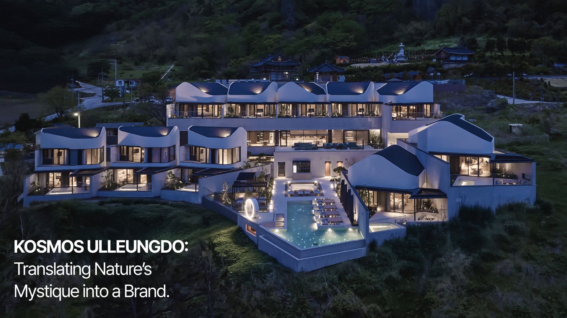
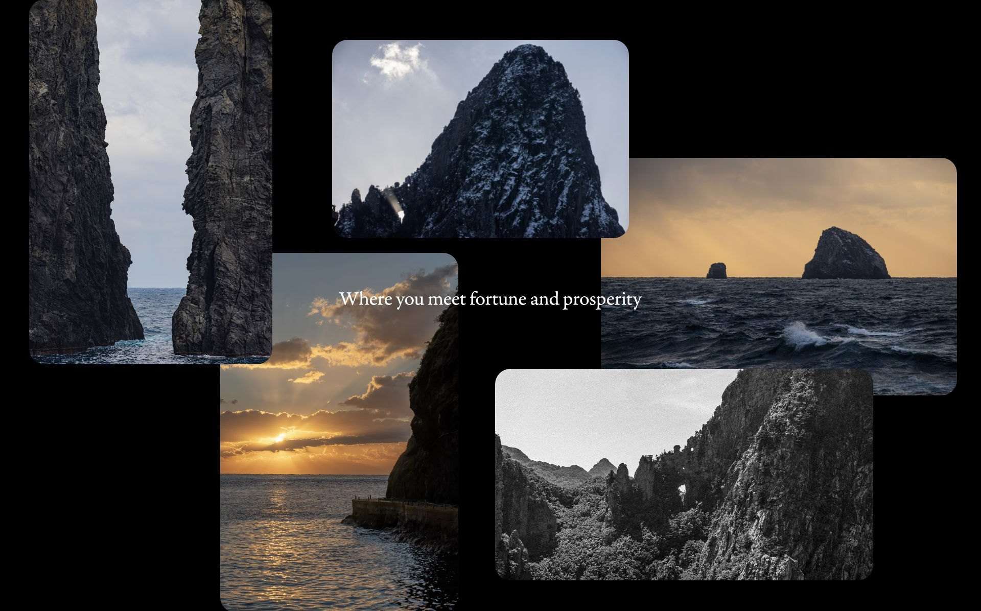
217km — the distance to the nearest mainland. Shaped by volcanoes and kept by the sea, Ulleungdo holds a mysterious energy of its own. The rebranding of Kosmos Ulleungdo began by identifying two forces at the heart of the brand — the land's value through Korean Feng Shui and the philosophy of yin-yang and the five elements — and translating them into a language accessible to all. With 'Where you meet fortune and prosperity' as its vision, that philosophy runs through space, service and visual identity, every touchpoint resolving into one brand experience.
One Identity, Every Villa
One Brand System, Distinct Villa Identities Within a Unified Experience
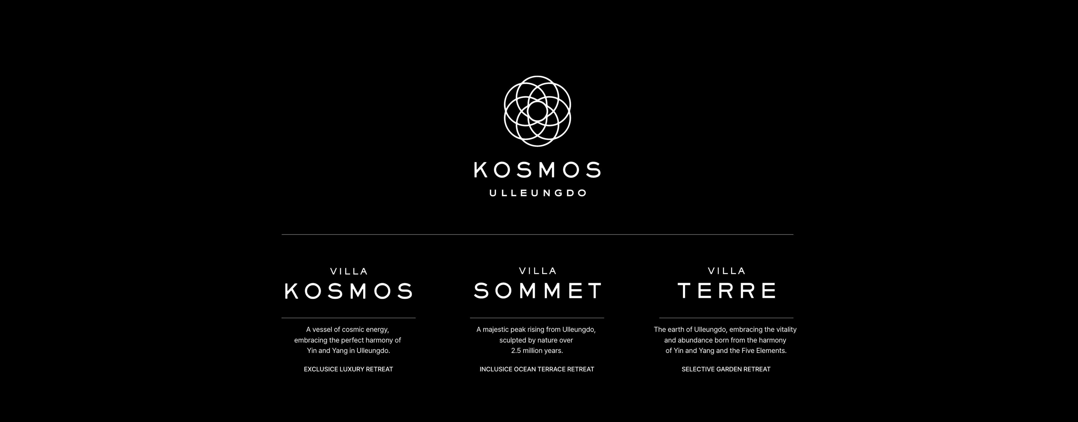
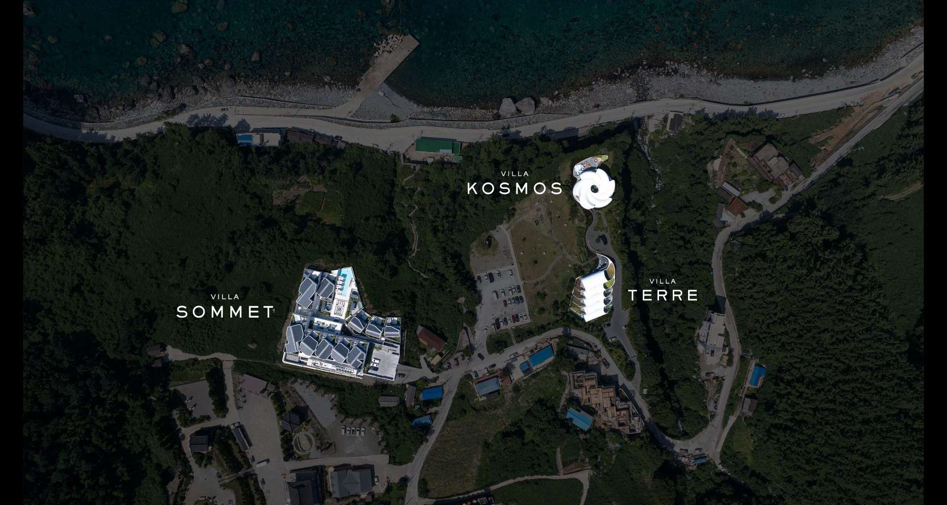
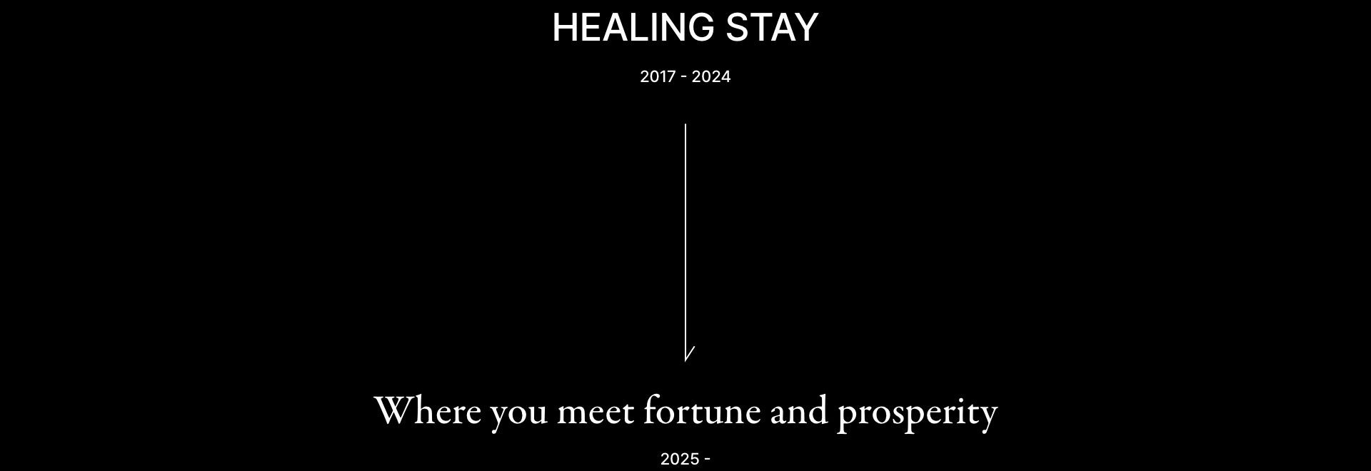
Kosmos Ulleungdo opened in 2017 with two buildings and underwent a brand renewal ahead of the 2025 opening of Villa Sommet. To bring properties of different hospitality levels under one brand, we sharpened Kosmos as Ulleungdo's high-end hospitality brand and defined a clear brand hierarchy across the properties.
One Brand, Every Name
Distinct Names, One Brand Language
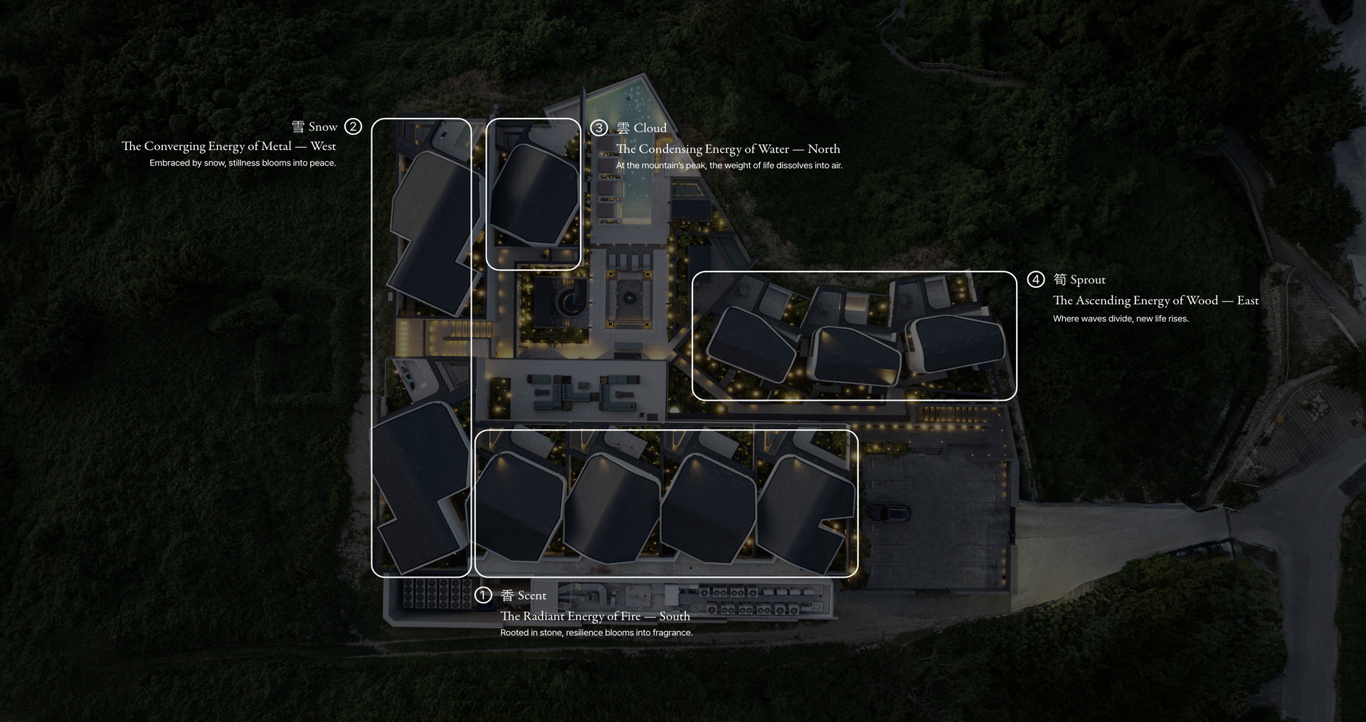
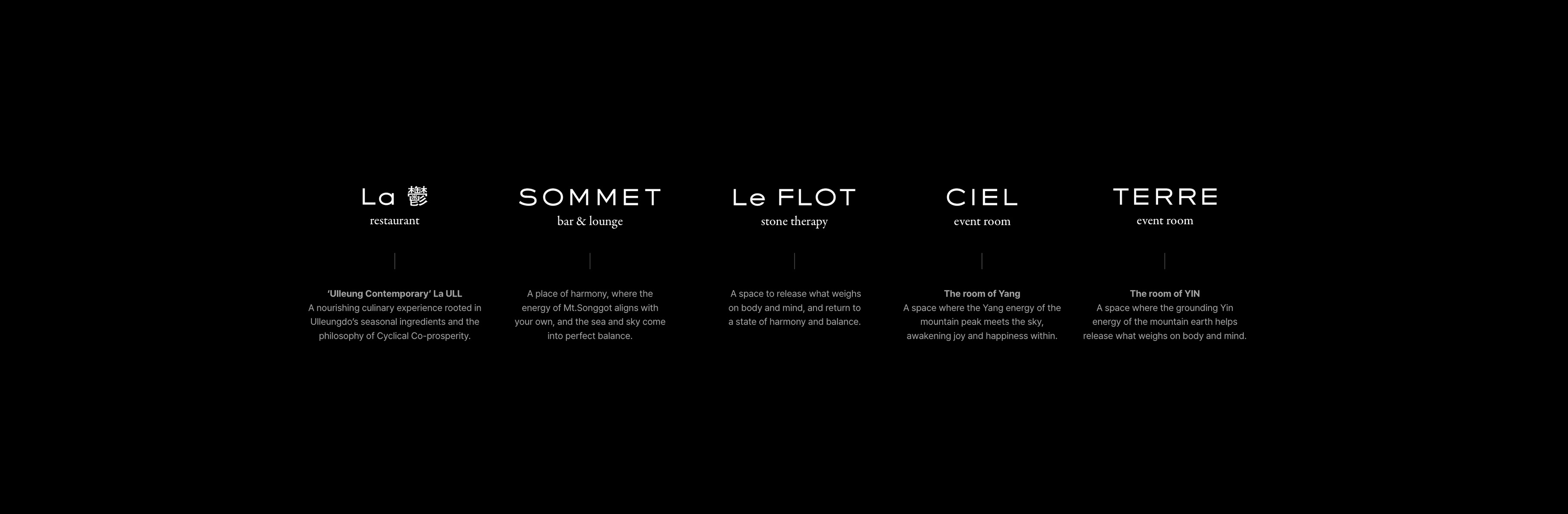
Ulleungdo's juniper, snow, sea of clouds and bamboo are paired with directional principles drawn from Yin and Yang and the Five Elements to shape each room's name. This language extends across the restaurant, bar & lounge, stone therapy and event rooms, bringing every space into one cohesive brand system.
Yin, Yang, and the Five Elements
Yin, yang and the five elements: how nature works. Everything begins with yin and yang.
Yin-yang and the Five Elements embody an ancient wisdom for understanding the forces of Mother Nature. Beneath Mount Chusan on Ulleungdo lies a rare myeongdang (明堂) — an auspicious site where vital energies converge, gathering good fortune and inviting prosperity. In Feng Shui, this land is also described as hoeryong-gojo (回龍顧祖), where the dragon turns back toward its origin.
This is where Kosmos stands: a name embodying cosmic order and harmony, with architecture aligned to the paths of the sun and moon. From this essence emerged sunhwan-sangsaeng (循環相生) — cyclical co-prosperity, a state in which energies continuously circulate and give rise to one another — and it became the foundation of the brand: Where you meet fortune and prosperity.
This is where Kosmos stands: a name embodying cosmic order and harmony, with architecture aligned to the paths of the sun and moon. From this essence emerged sunhwan-sangsaeng (循環相生) — cyclical co-prosperity, a state in which energies continuously circulate and give rise to one another — and it became the foundation of the brand: Where you meet fortune and prosperity.
Inspired by the Paths of the Sun and Moon
A brand system that began in the paths of the sun and moon
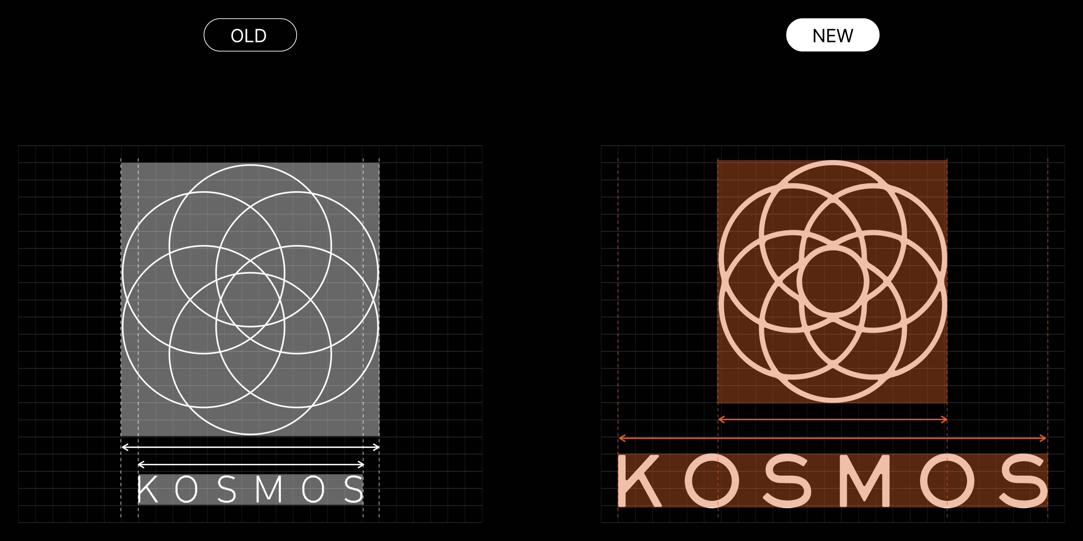
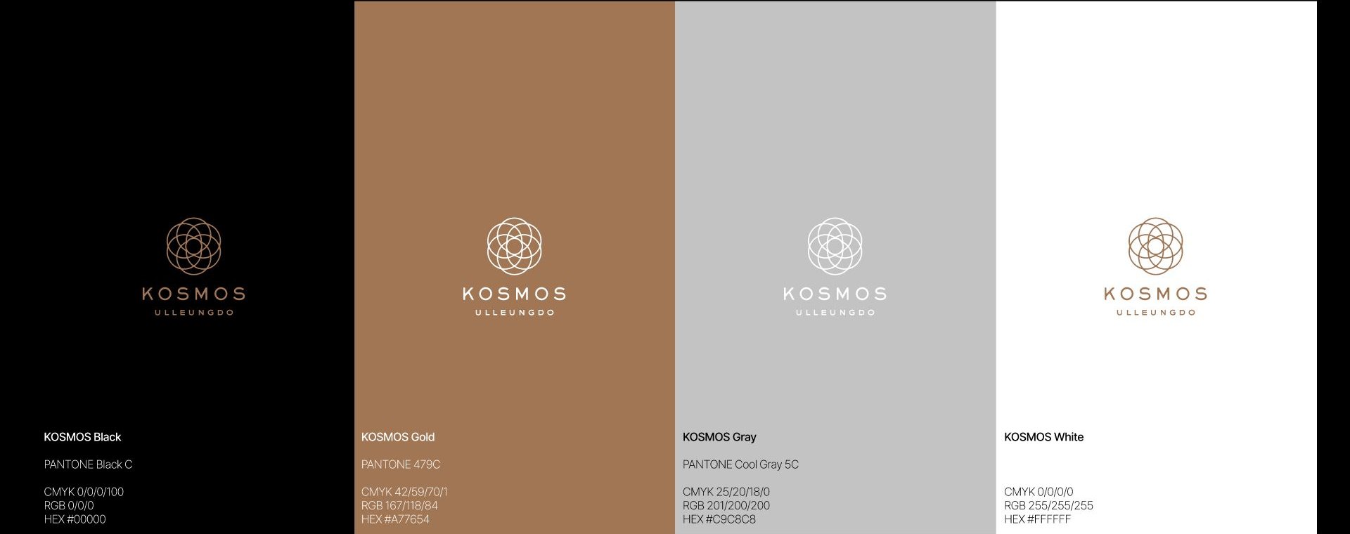
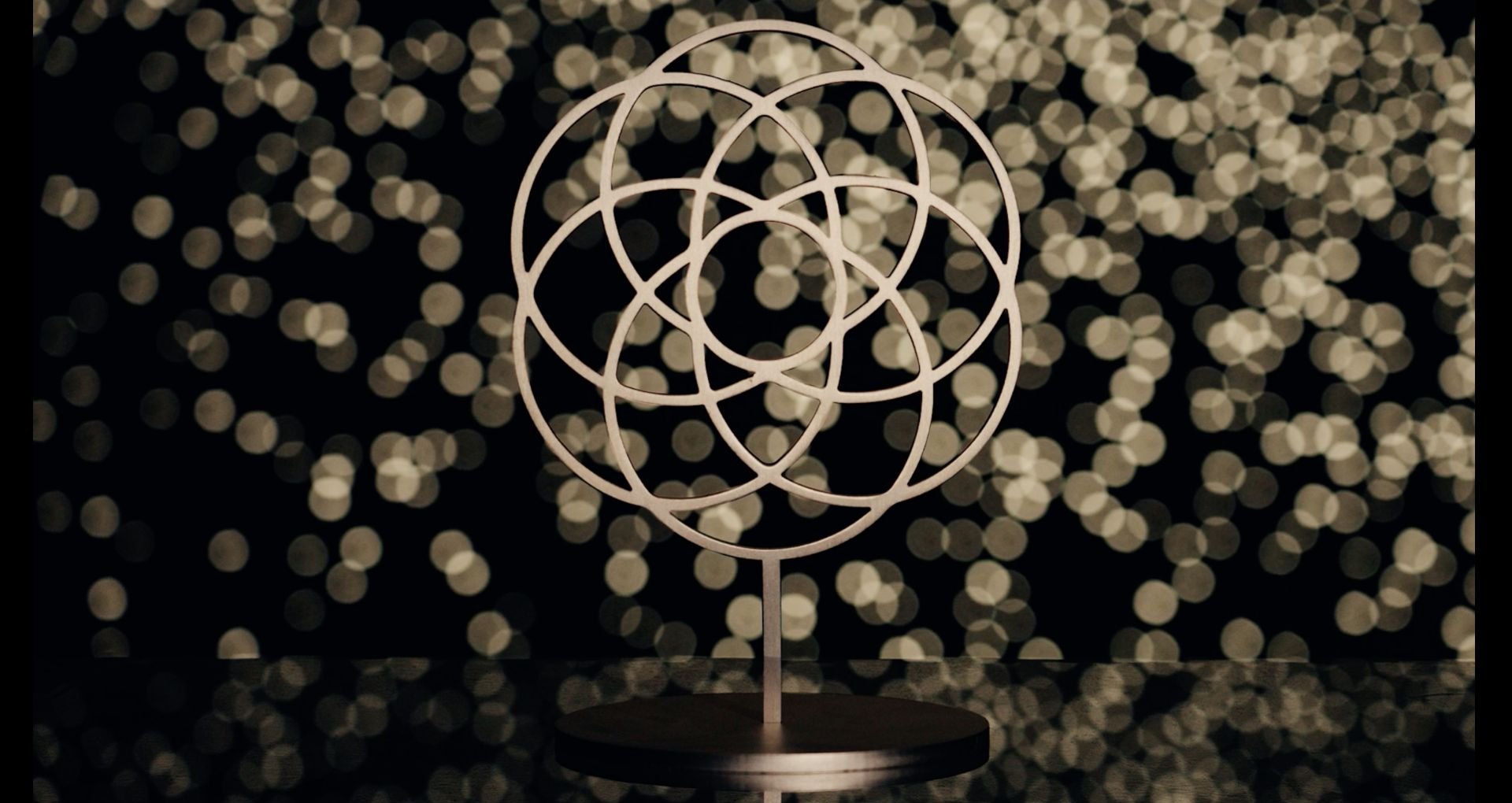
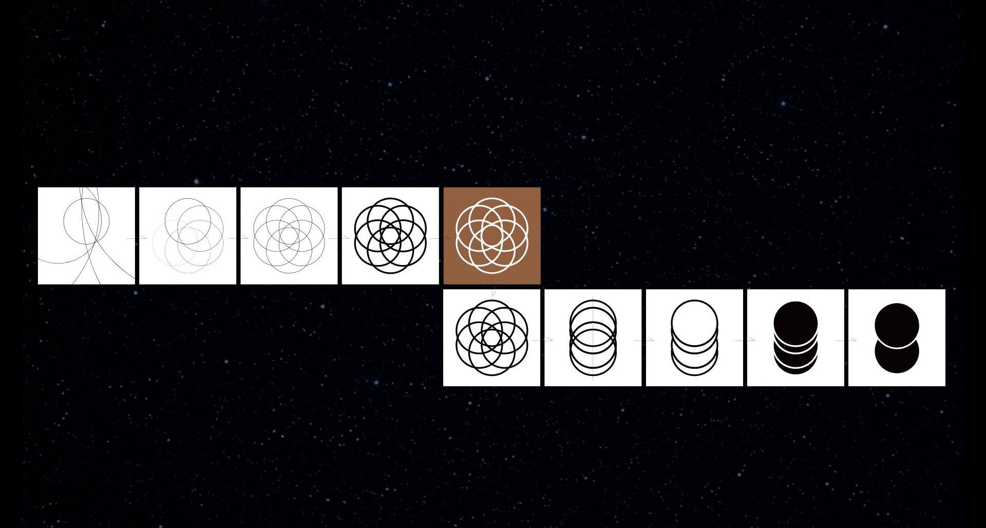
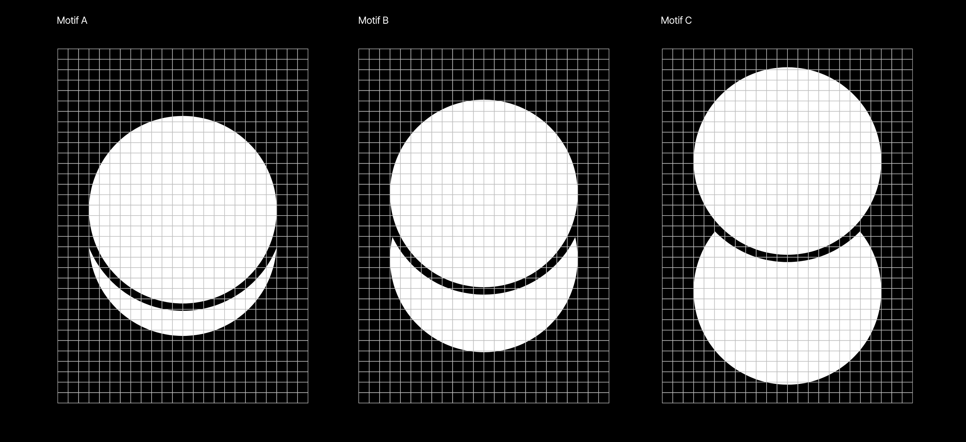
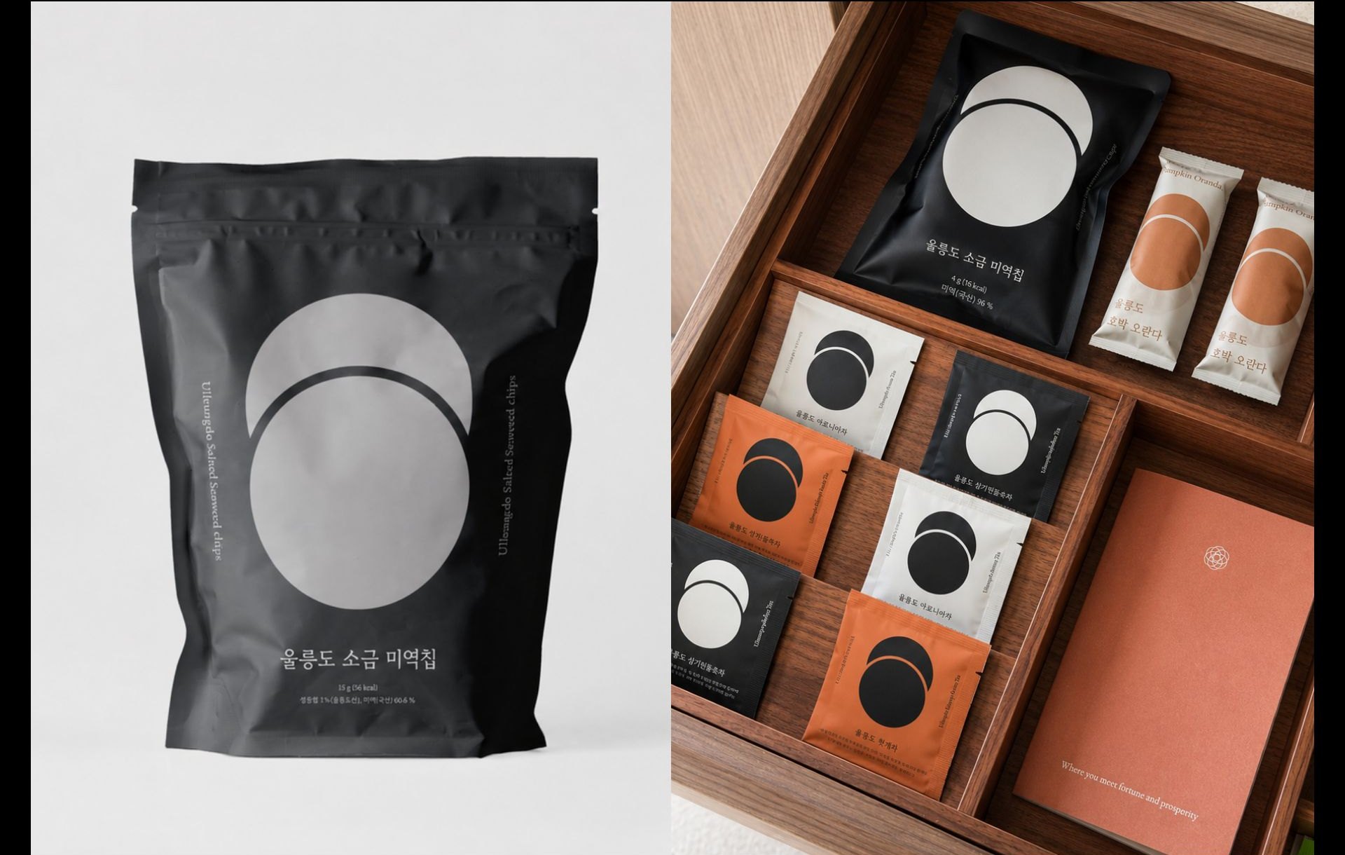
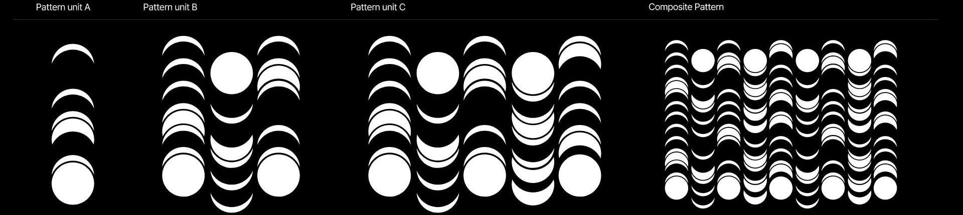
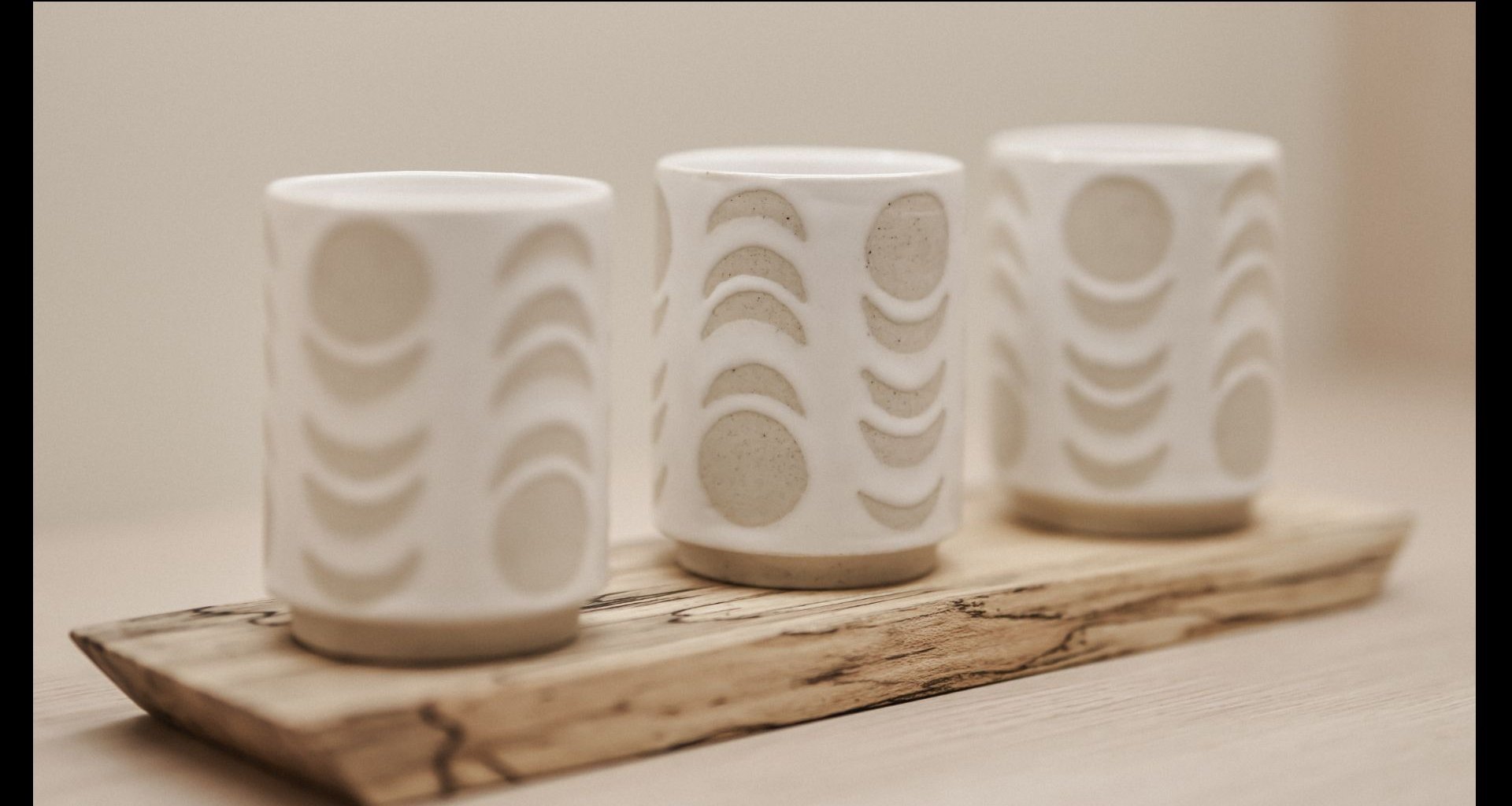
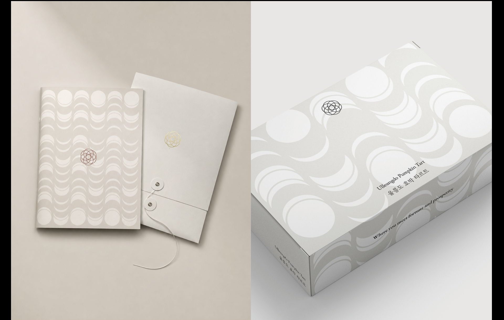
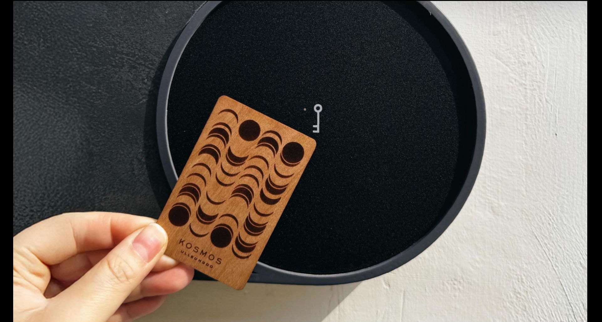
The KOSMOS ULLEUNGDO logo reinterprets cosmic order and cyclical harmony through a refined, high-end expression. Its six circles, inspired by the paths of the sun and moon across Ulleungdo's sky, are refined in line, curve and proportion to create a clearer symbol. The same principles shape a visual language of motifs and patterns inspired by the balance and circulation of yin and yang, carried consistently across space, graphics and every brand touchpoint.
One Visual Language, From Identity to Signage
The paths of Sun and Moon — Yin and Yang — Shape the Spatial Language
Signage goes beyond wayfinding to bring the brand philosophy into the spatial experience. The balance and circulation of yin and yang in the logo extend through curves, proportions and forms, while pictograms, typography, colour and materials follow the same language — connecting every indoor and outdoor touchpoint.
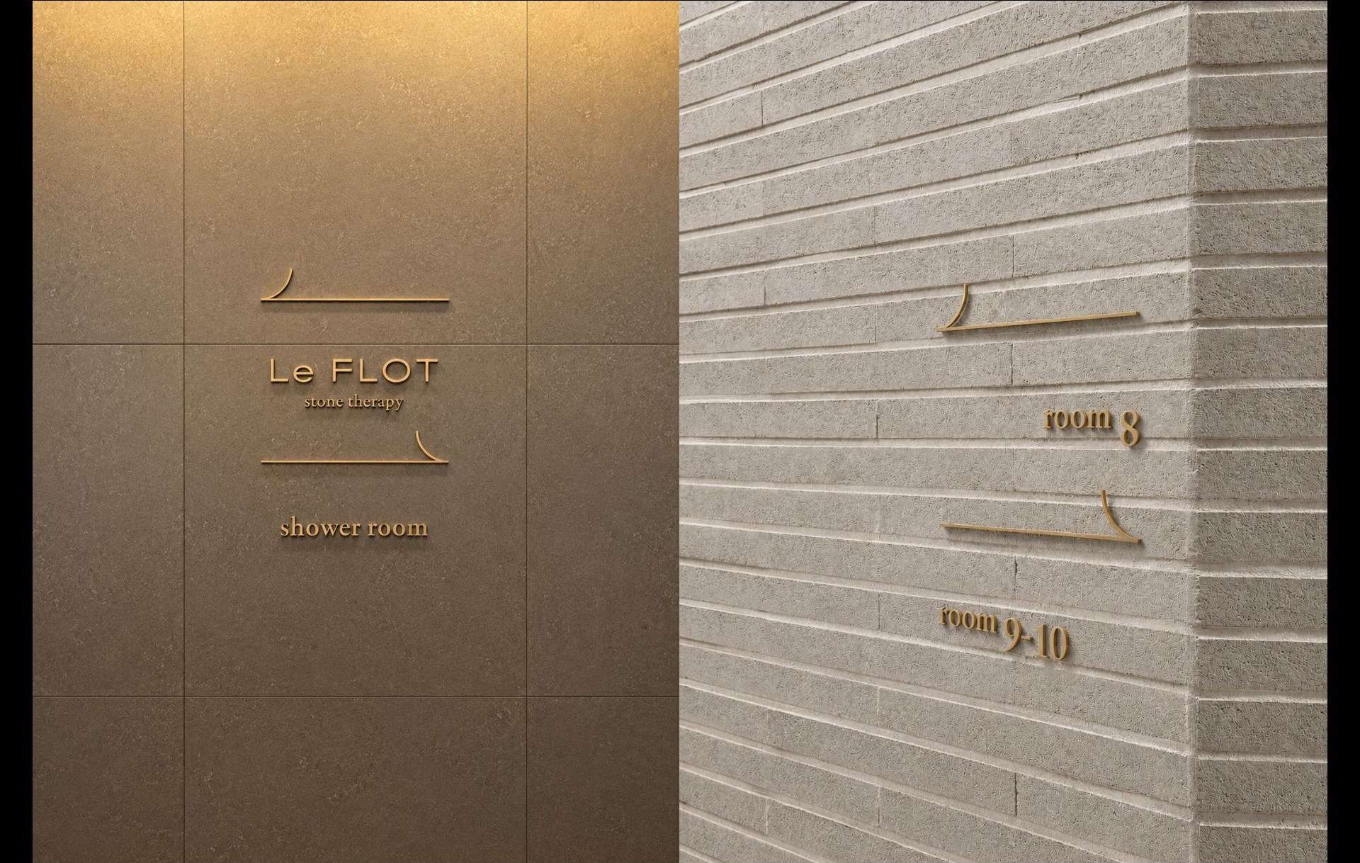
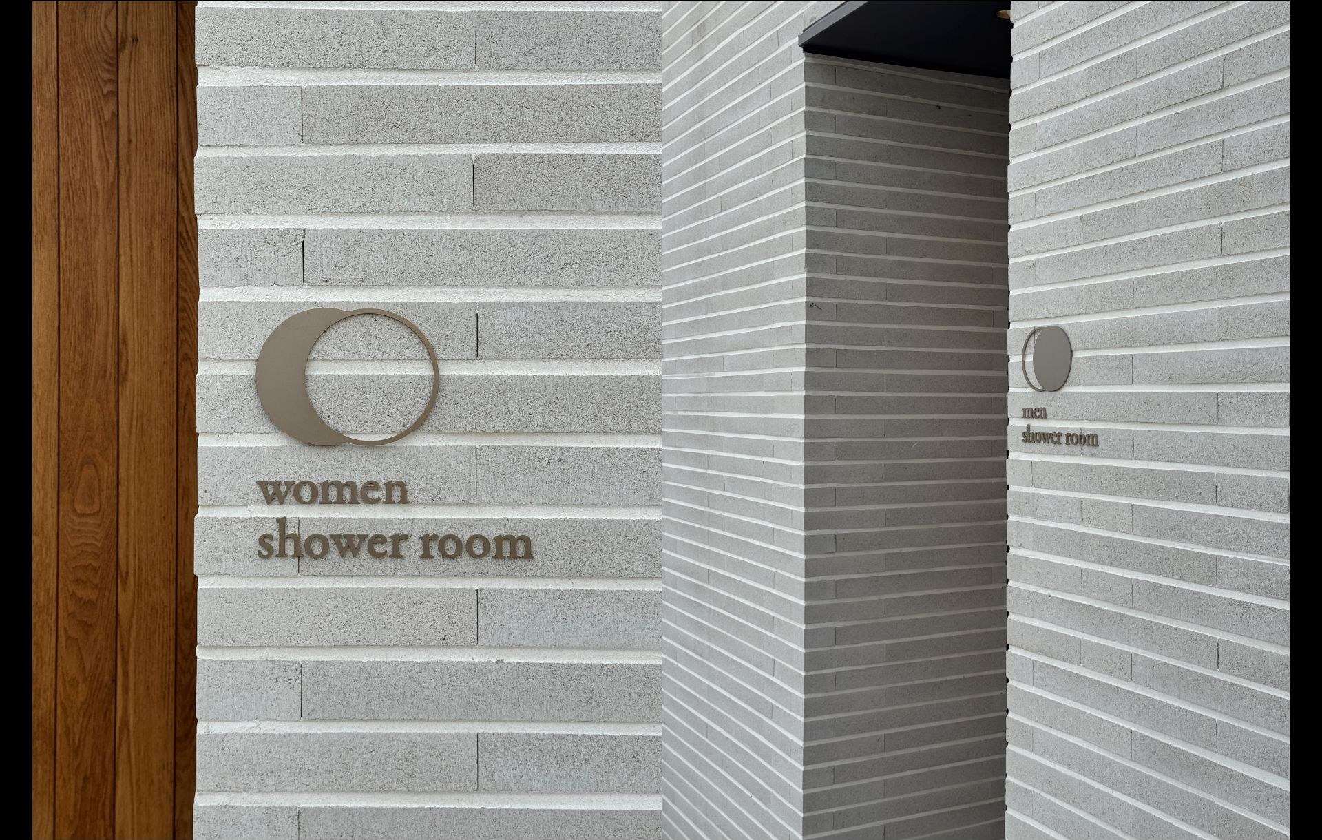
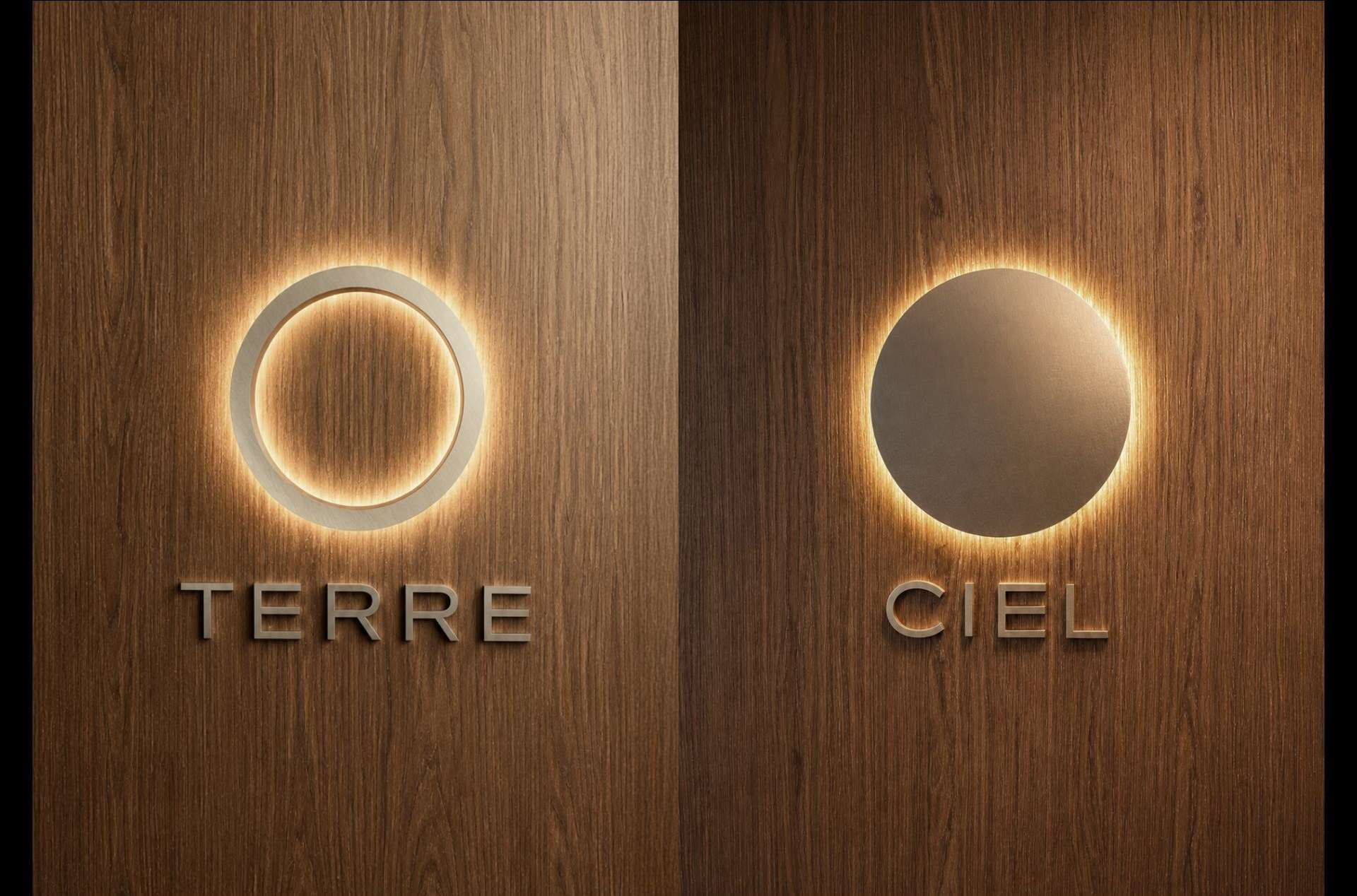
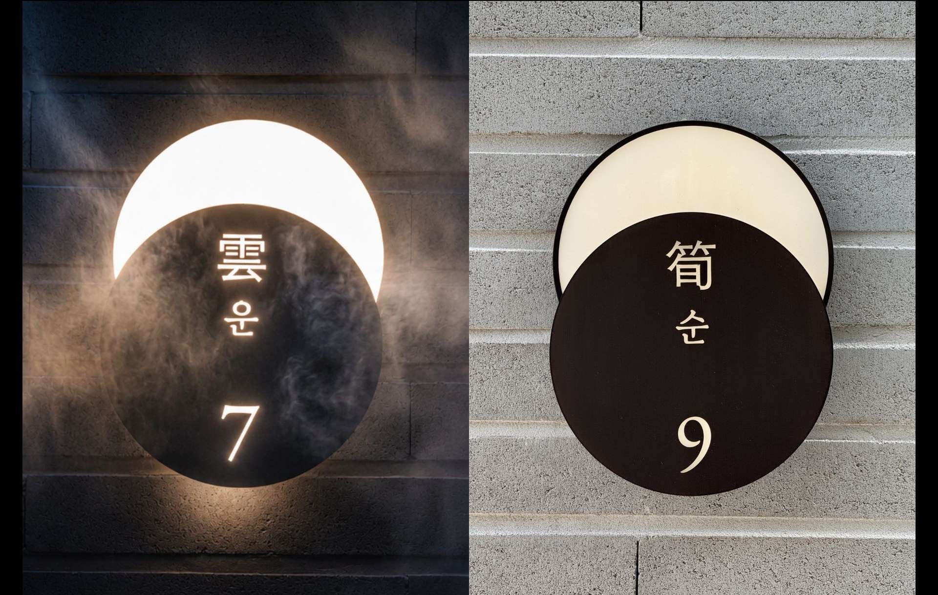
The Journey of the Cyclical Co-Prosperity
Translating the Philosophy into Meaningful Experiences
In Yin and Yang and the Five Elements, nature moves through the cycle of wood, fire, earth, metal and water. The most auspicious state of all — a fortune that endures across generations — is known as sunhwan-sangsaeng (循環相生) — cyclical co-prosperity.
We translated this principle into five energies, each embodying a different form of fortune: opportunity, success, health, happiness and abundance. The brand experience unfolds through five journeys, each offering a different path to fortune and prosperity.
We translated this principle into five energies, each embodying a different form of fortune: opportunity, success, health, happiness and abundance. The brand experience unfolds through five journeys, each offering a different path to fortune and prosperity.

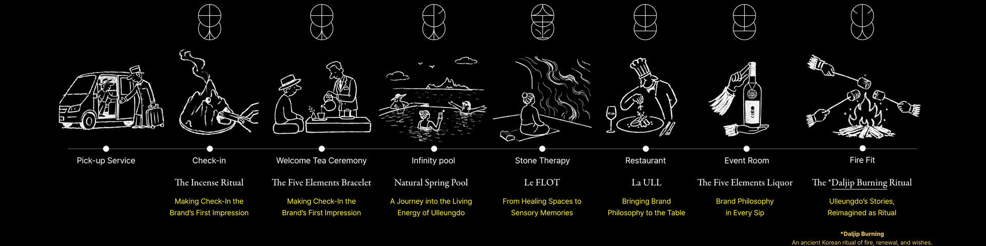
Experience Design
Program Design
The Wood Journey 木
Meet Your Fortune and Prosperity
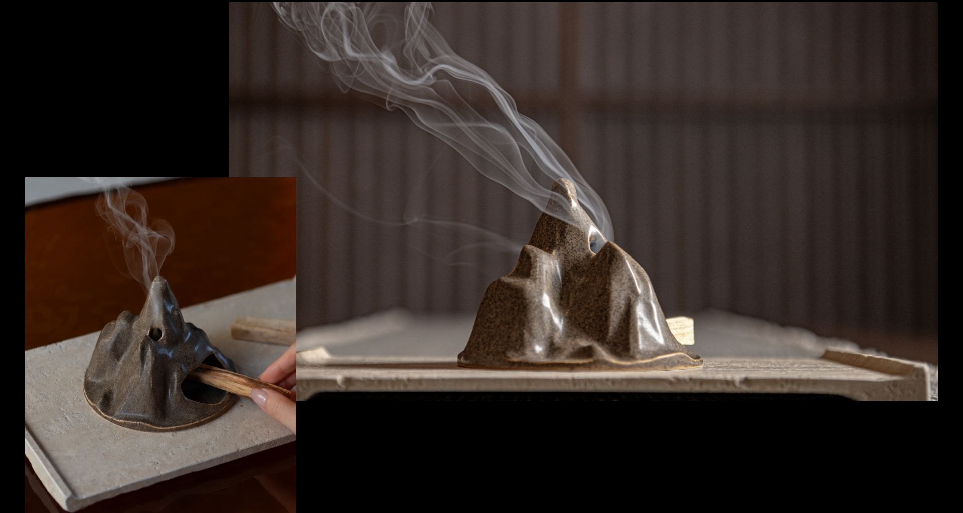
Experience Design
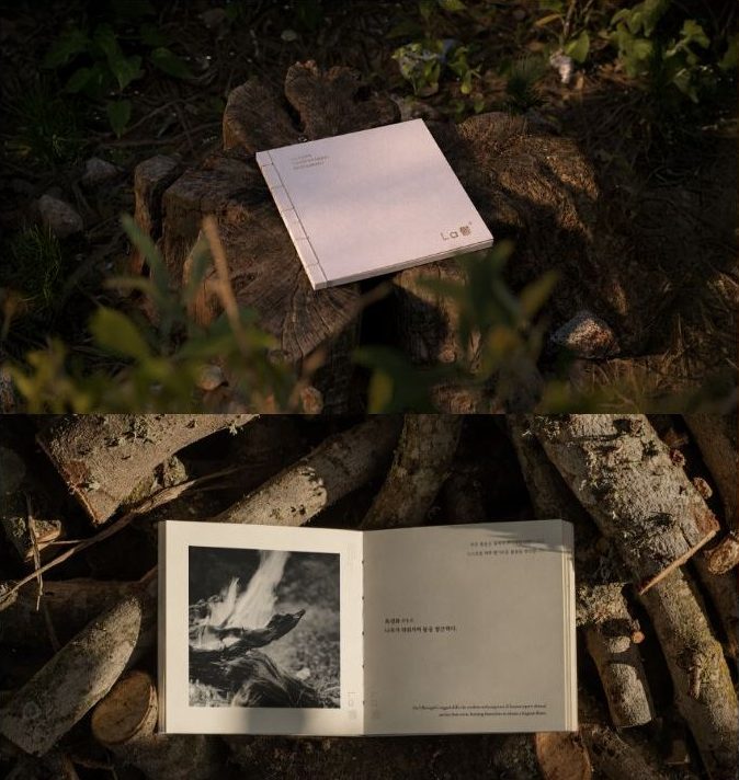
Storytelling
Ritual Design
The Fire Journey 火
A Ritual for Success
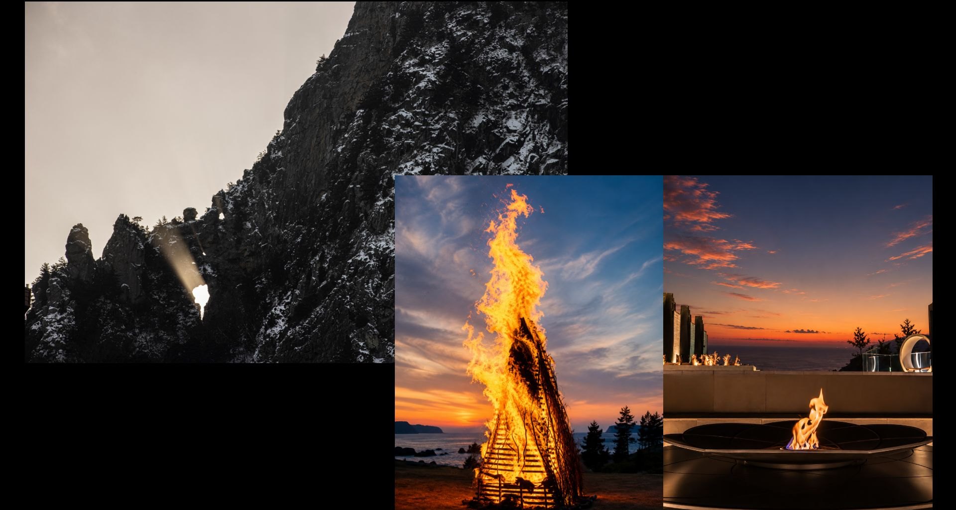
Experience Design
F&B Concept Development
Culinary Storytelling
Menu Book Design
Promotion Film Direction
The Earth Journey 土
Savor Happiness Together
The Five Elements Liquor
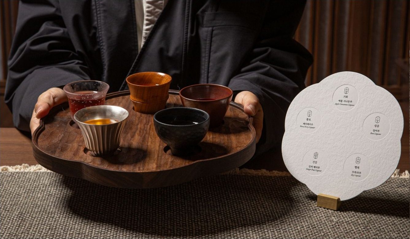
Experience Design
Visual/Film Direction
Vessel Design
The Metal Journey 金
Balance for Body and Mind
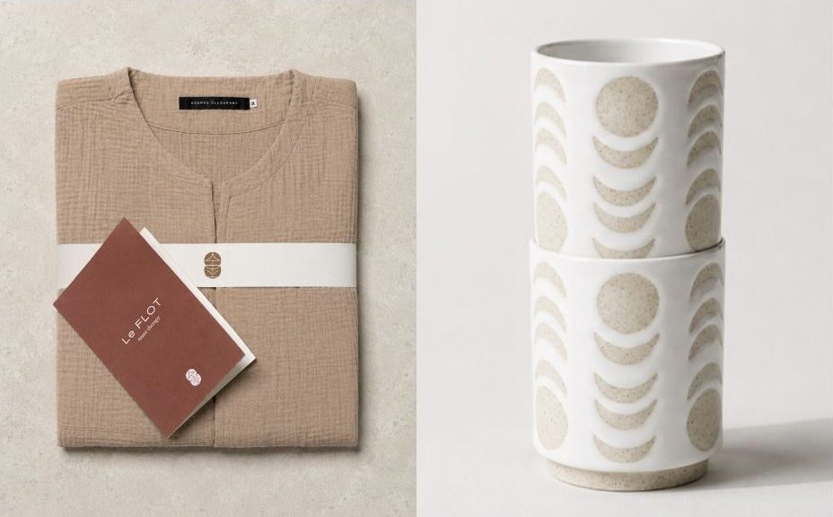
Experience Design
Value Storytelling
Content Planning
The Water Journey 水
Where Prosperity Flows
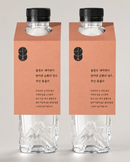
Everything you see, feel, experience
The Brand, Woven Into Every Experience
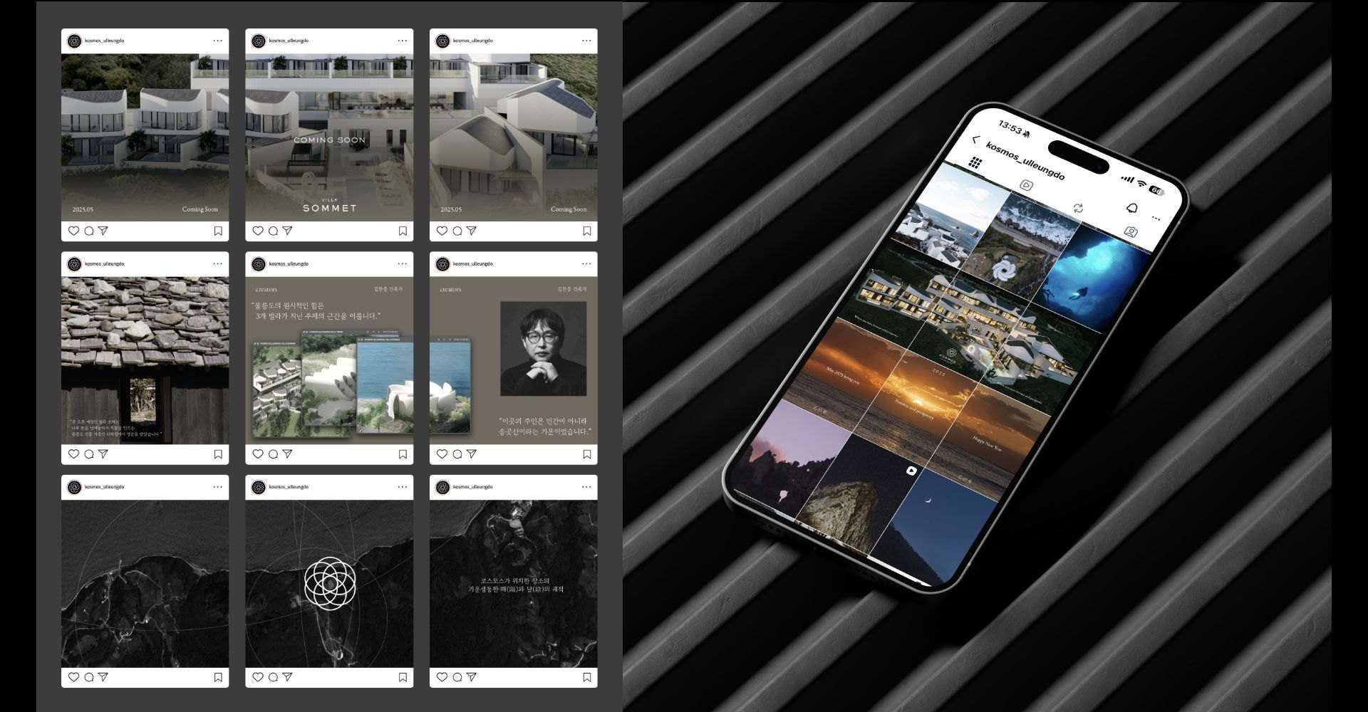
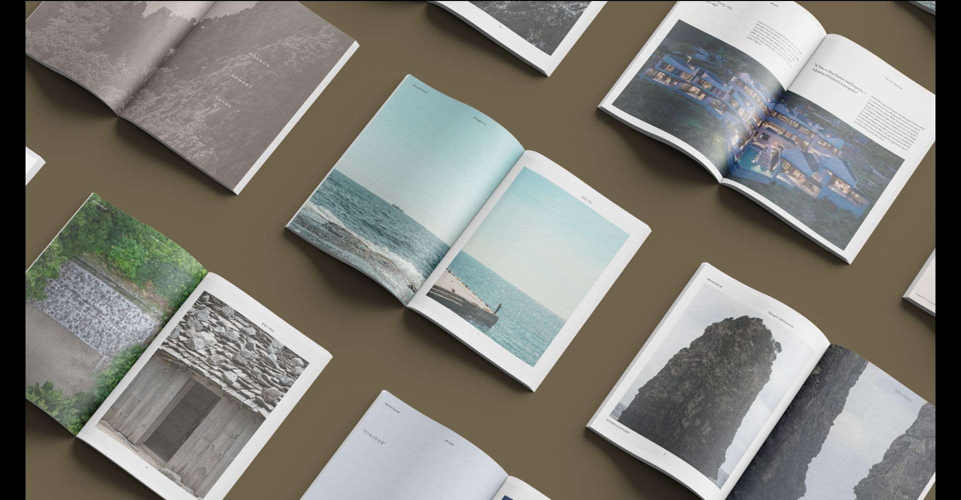
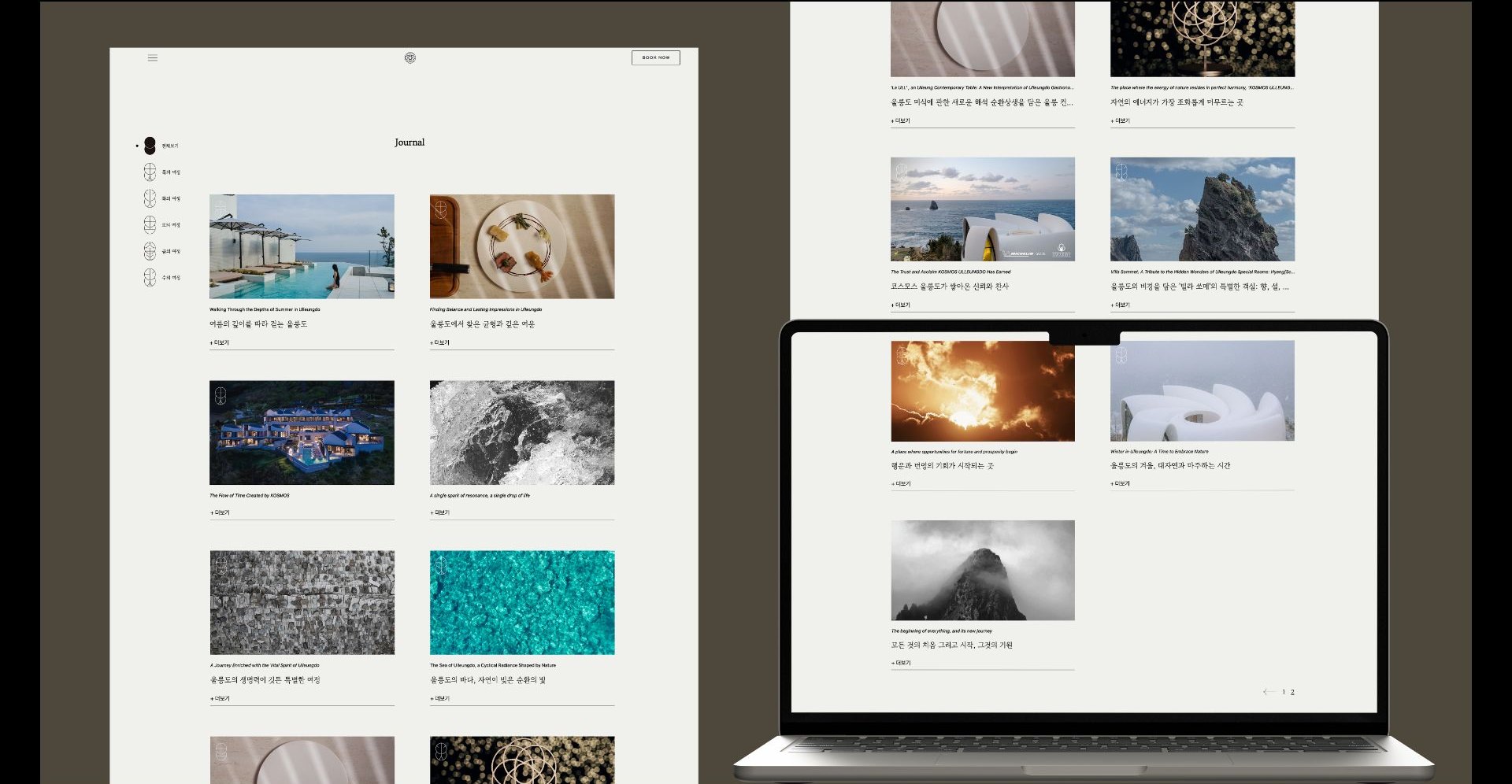
A brand is not understood all at once; it reveals itself through the details encountered along the way. We extended Kosmos's identity across every layer of the experience — from the physical space to digital channels, from brand books and compendiums to the website and social content. Together, these expressions allow the brand's philosophy to flow naturally throughout the stay.