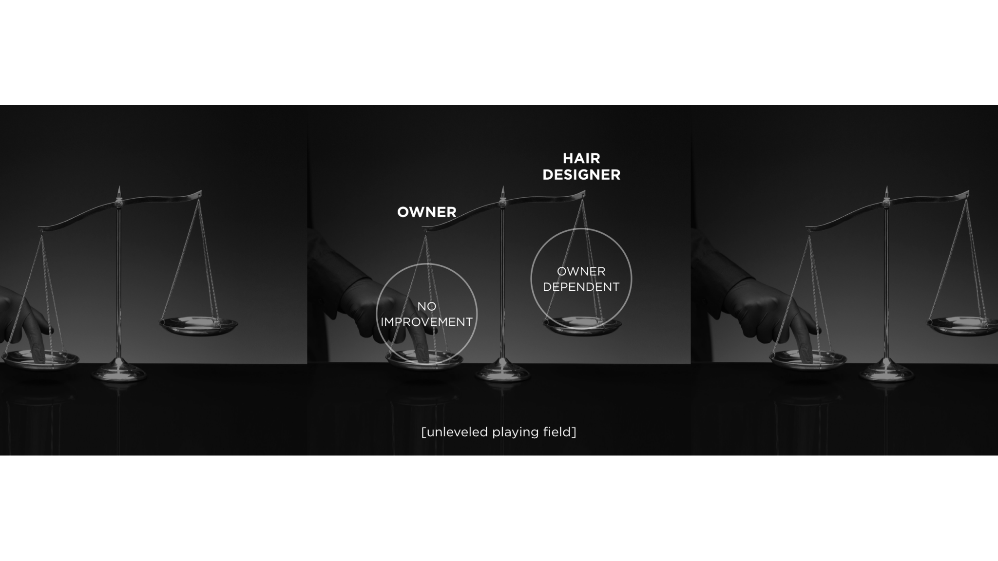
The domestic beauty market, worth 7 trillion KRW, is a market driven by entrepreneur that owns offline salons. 80 percent of the domestic hair designer is working in a salon with fewer than four workers, because they suffer from the huge initial expenses including rent to open their own salon.
[palette h] has created a space for talented hair designers to do business under their names. Unlike the existing beauty salons, it offers marketing and value-added services so that designers can focus on only beauty treatments.
"Shared hair salon" is a space where potential talented people can show their competence . We will be joining the journey of a new leap until hair designer grows into brands.


we aim for a platform where designers and designers, designers and customers respect each other and continue to grow on the same line. Create value that one designer grows into a brand, Provide a place for hair designers to expand their capabilities, Experience a variety of trendy and talented designers in one place.

This is where my "identity" begins to allow designers to grow "on their own",to share "flexibly" by various designers, and to create a "delicate" difference between designers and customers
A platform for designers to stand on their own feet and bring self growth and good changes.
Flexible space shared by designers from various environments without being bound by one rule.
Delicately equipped hardware makes designers and customers to conveniently served.
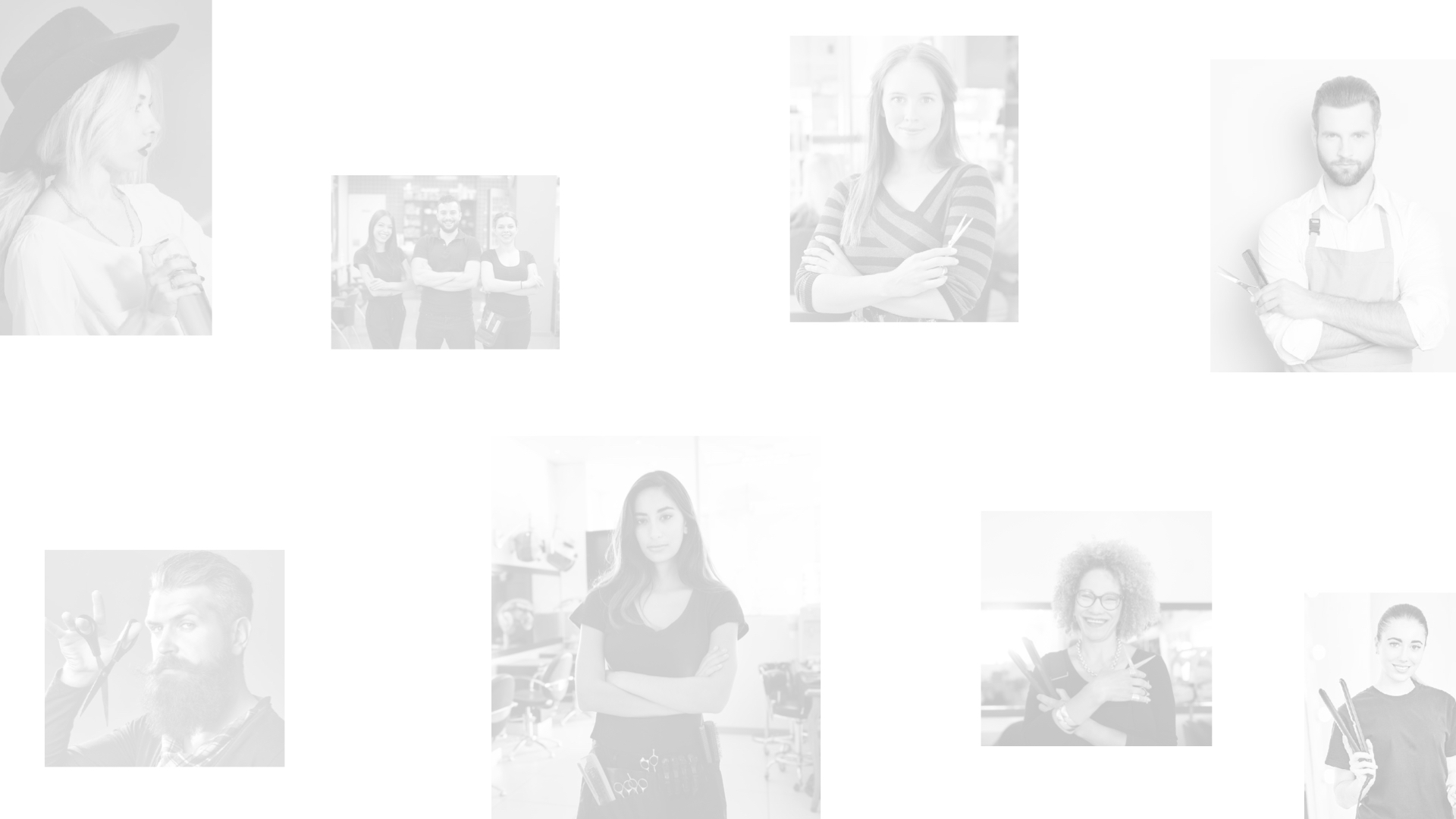
[PALETTE] means a painting tool in which various colors of paints coexist and mix various colors. The colors used by each artist and the way they are used are also included in the word [PALETTE].
[H] contains extensibility meanings of all words derived from [H] including -Hair, Home, Hotel, Harmony, High growth, High-end.
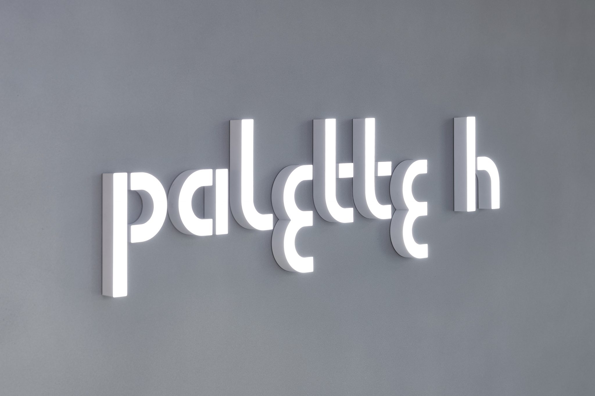
The brand naming meaning of [palette h] is a combination of the word [PALETTE] and [H]. The brand naming of [palette h] symbolizes the brand meaning of the “shared beauty parlor platform” where various designers present their own colors [identities].
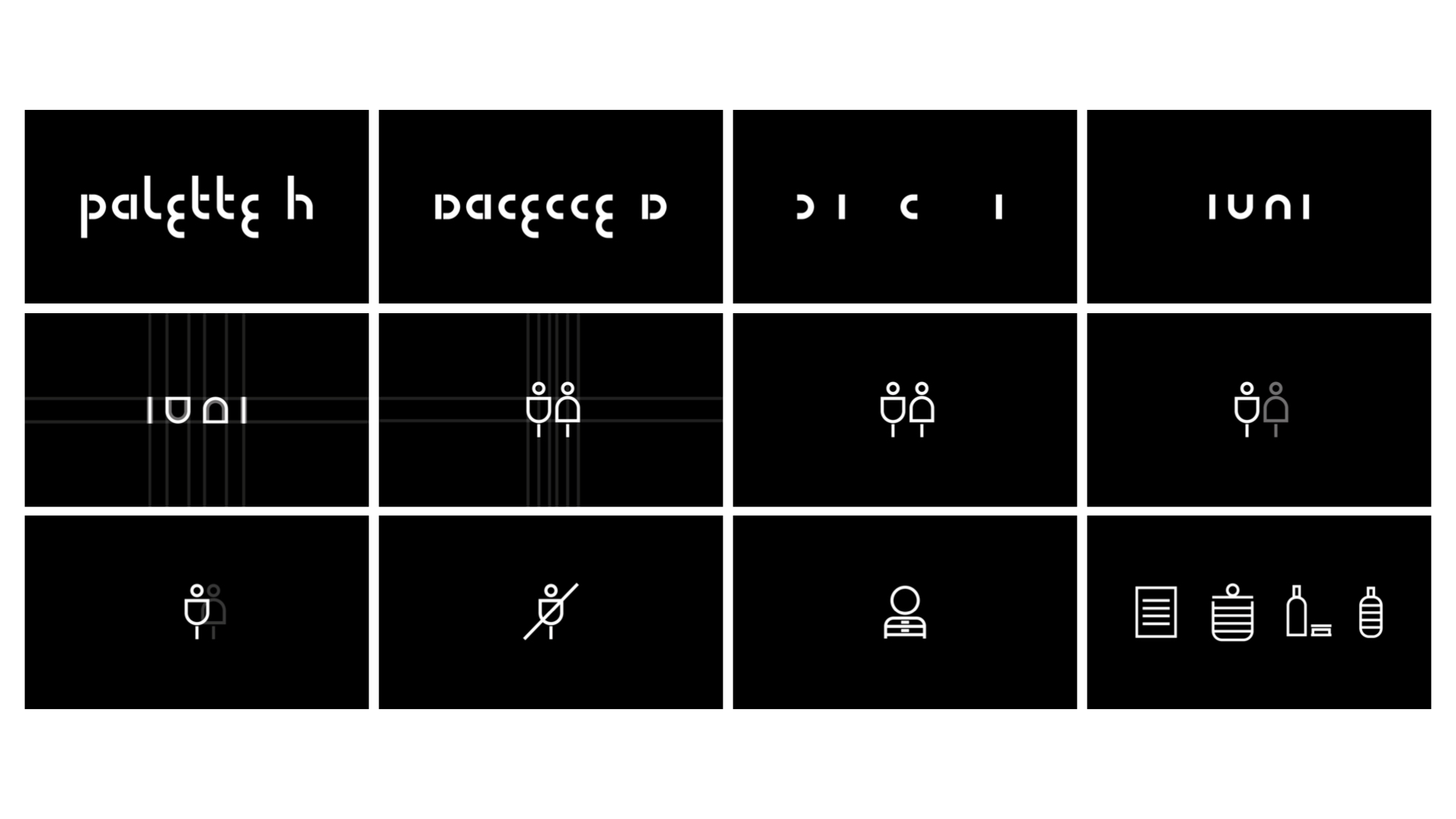
The brand logo design concept of [palette h] is derived from the keywords (1)Identity, (2)Unique & New, and (3)We. The ‘I’ form of identity that symbolizes designers with their own colors, the ‘U’ and ‘N’ forms of Unique & New that give designers and customers a unique and new experience, and various designers We’s ‘W’ form symbolizes the details of the Palette h’s brand logo typeface.

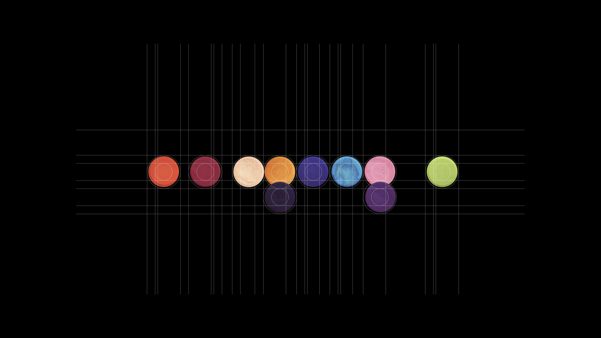
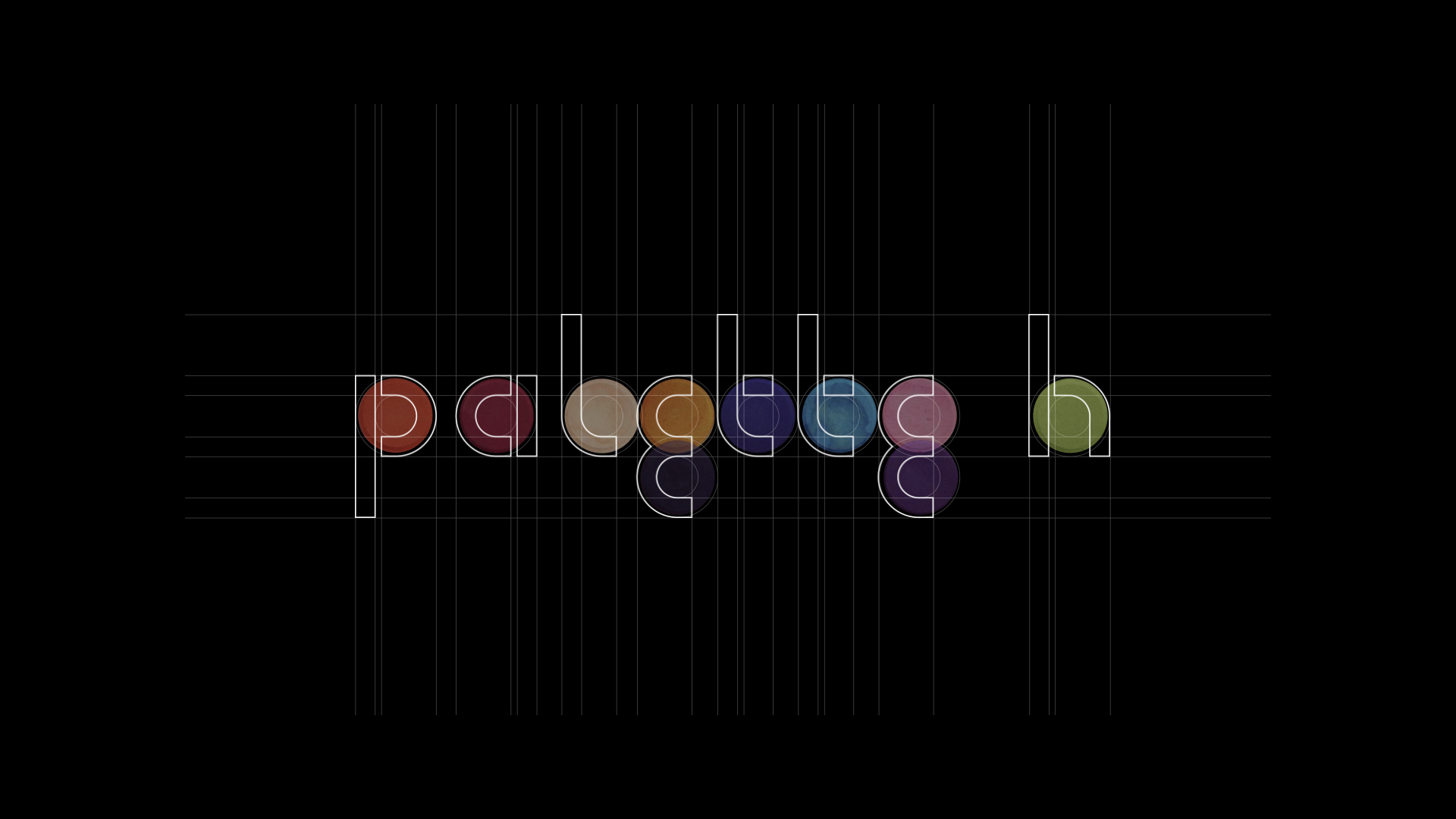
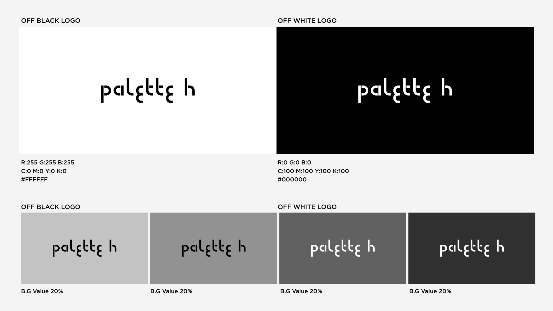
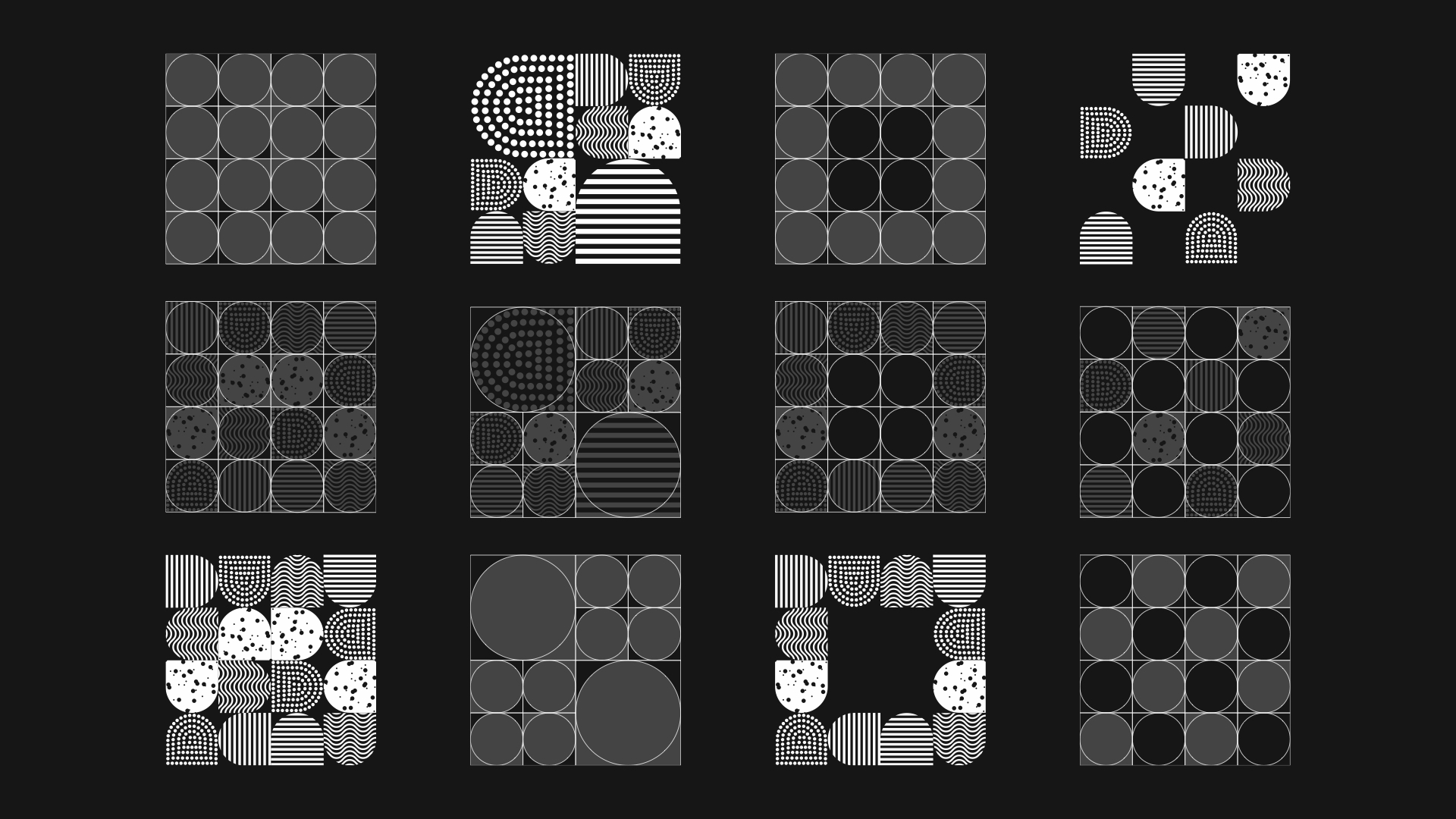
The brand symbol in [palette h] uses the repetitive detail form of the typeface derived from the keyword of the brand logo as the symbol motif. The brand symbol of [palette h] consists of four different unit textures, starting from the most basic filled painting, line drawing, sprinkle, dot and curve drawing. Like using paints in various ways on paper, the brand symbol of [palette h] is a symbolic element showing the designer’s own color [identity].
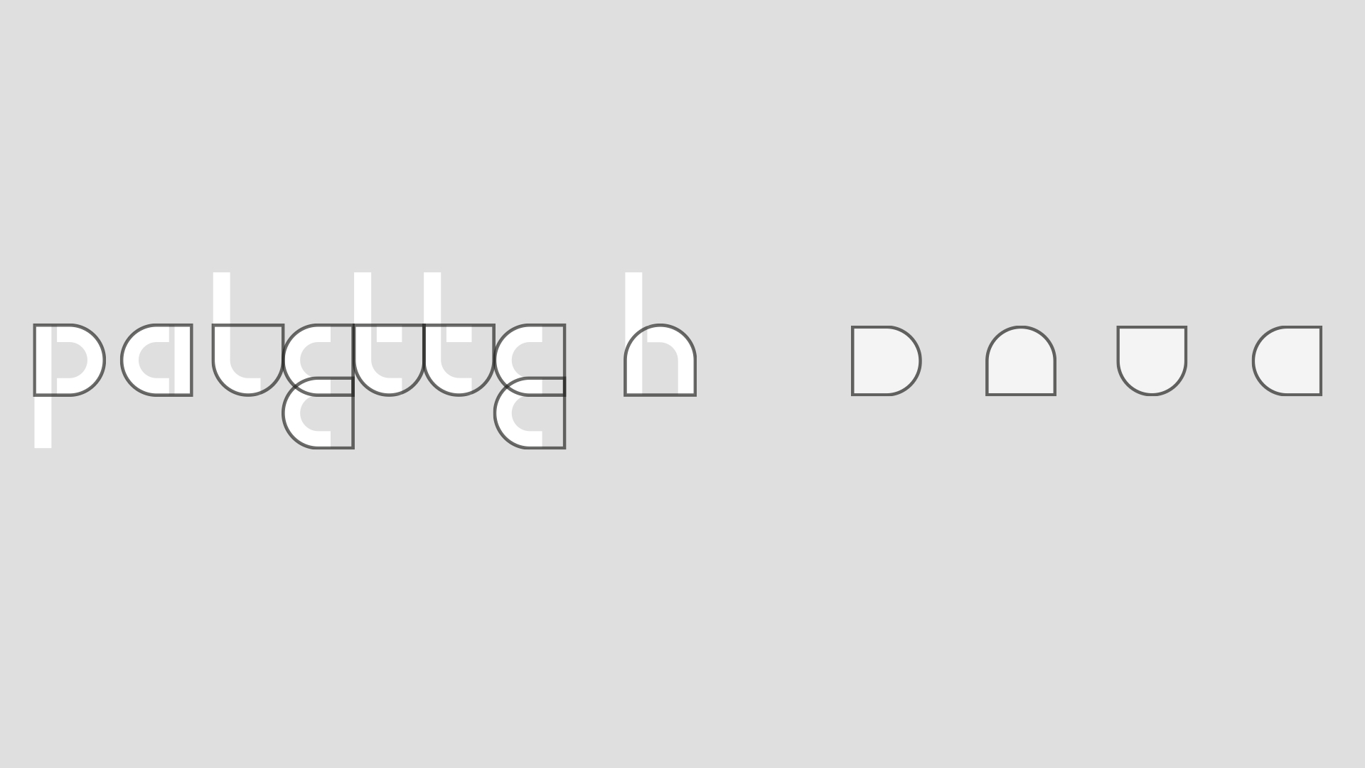

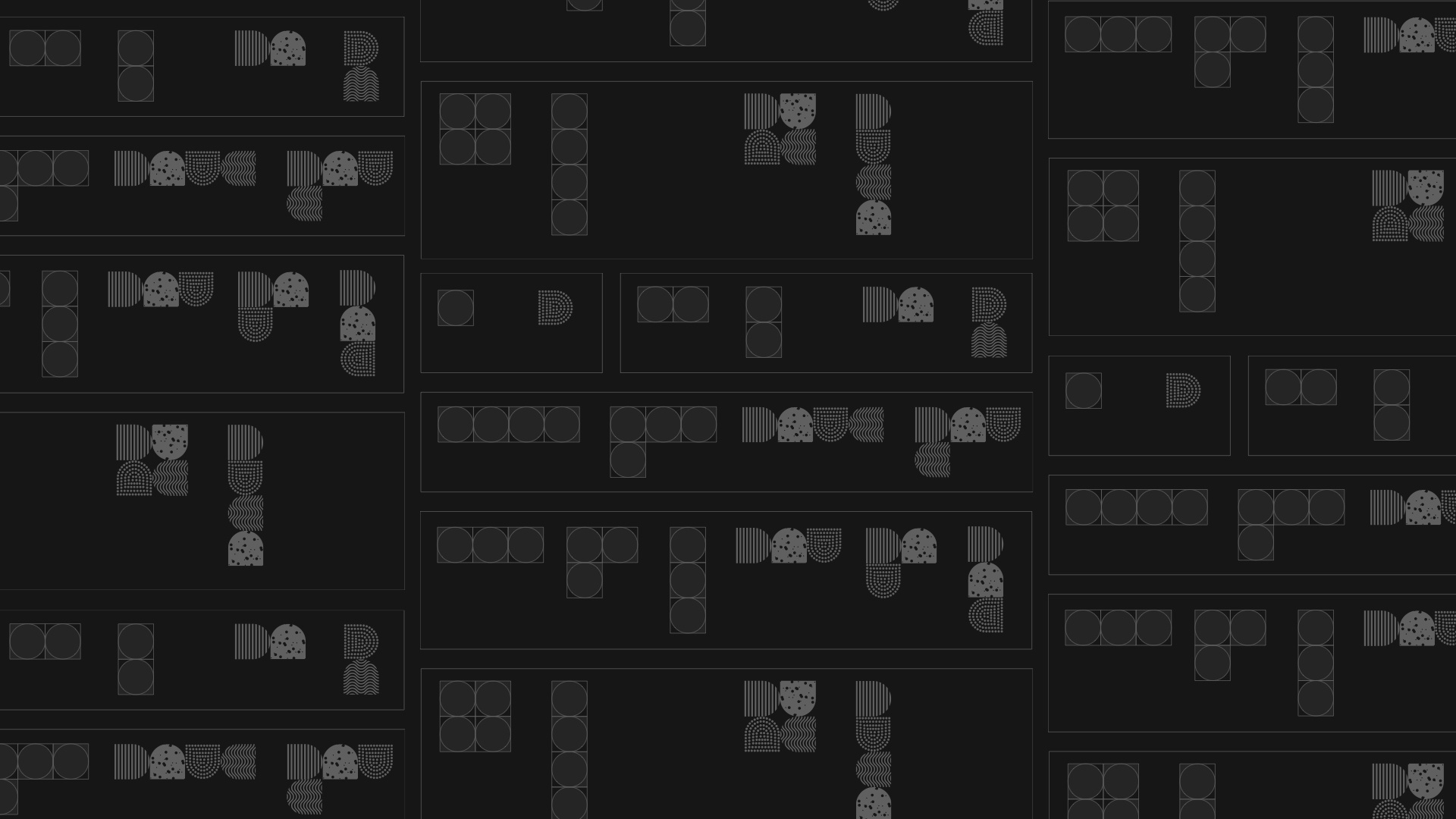
Symbols can be used in a variety of units from 1 to 4 units based on the use of 4 unit textures. Both horizontal and vertical applications are available, and combinations of 4 units or more are used as patterns. When the pattern is applied, the size of the unit can be changed flexibly within the ratio provided by the guide.
